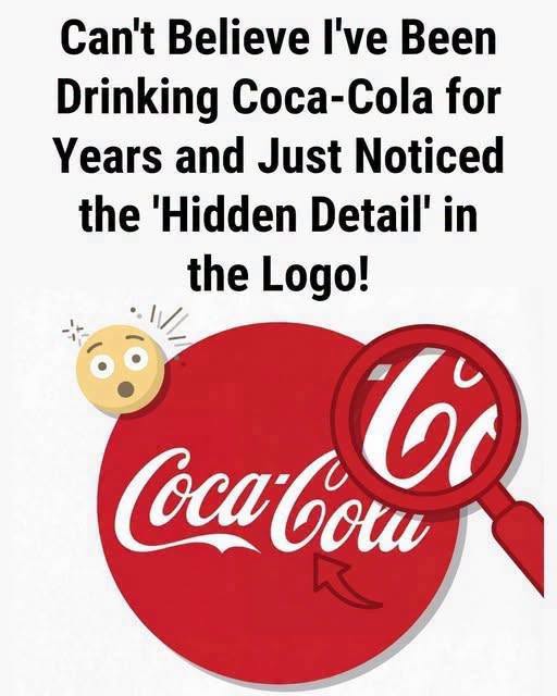
…of consumers and marketers alike. This phenomenon, which often gains traction through viral posts, suggests that the negative space between specific letters contains a subtle nod to a national flag or an unintended symbolic shape. However, to understand why these patterns emerge in our collective consciousness, one must first look at the origins of the logo itself, which was never intended to be a cryptic puzzle but rather a functional piece of late nineteenth-century graphic design meant to convey elegance and authenticity.
The script was created in 1886 by Frank Mason Robinson, the bookkeeper for the company’s founder, John Stith Pemberton. Robinson possessed a keen eye for penmanship and believed that the double “C” would look aesthetically pleasing in advertising. Using the popular Spencerian script, a style of cursive writing widely taught in American schools at the time, he drafted the wordmark that would eventually become the most recognized brand signature on the planet. It was a choice rooted in the professional standards of the era, emphasizing fluid, graceful lines that suggested sophistication and trustworthiness to the average consumer.
Over the decades, the logo underwent minor refinements, yet it remained remarkably consistent. It survived the transition from hand-painted signage to mass-produced lithography and eventually to the digital age. The red-and-white color scheme, which solidified in the mid-twentieth century, served to enhance the legibility and emotional impact of the script. Because the design is so deeply ingrained in our visual vocabulary, our brains are naturally prone to seeking out patterns, shapes, and familiar forms within its complex, looping structure. This is where the concept of pareidolia comes into play.
Pareidolia is a psychological phenomenon in which the human brain perceives a meaningful image, such as a face or a symbol, in a random or ambiguous visual stimulus. When we stare at the intricate, overlapping curves of the Coca-Cola logo, our minds attempt to organize the visual data into something recognizable. If a viewer is told that a hidden detail exists, their brain will actively scan the negative space and the intersections of the letters until it finds a pattern that matches the suggestion. It is a testament to the power of suggestion rather than the intent of the original designer.
The viral claims regarding the logo often point to the space between the letters, specifically the area near the “o” and the “l” or the flourish of the “C.” Critics and design historians argue that these interpretations are purely coincidental. When Frank Mason Robinson drafted the logo, he was focused on the balance of the letters and the overall rhythm of the word. He was not utilizing complex, multi-layered graphic design software to embed subliminal imagery. The logo was a product of manual penmanship, and its evolution has been focused on maintaining that original, human-centric aesthetic rather than altering it to include hidden symbols.
Furthermore, the nature of the Spencerian script itself is inherently ornamental. Its loops and flourishes are designed to flow into one another, creating a sense of movement. This inherent complexity is precisely why it is so easy to project various shapes onto it. If one looks at any complex, cursive wordmark long enough, the brain will inevitably begin to isolate segments and assign them meaning. The fact that the Coca-Cola logo is viewed billions of times a year ensures that, statistically, someone will eventually find a pattern that looks like something else and share it as a discovery.
It is also important to consider the role of brand loyalty in this phenomenon. Coca-Cola is more than just a beverage; it is a cultural artifact. People feel a personal connection to the brand, and the desire to find a “secret” within its design is a way of engaging with that history. It transforms a passive viewing experience into an active investigation. While the company has never confirmed these hidden details, the persistent rumors do not harm the brand; instead, they highlight the enduring fascination that the public maintains for such a simple, yet perfectly executed, piece of design history.
Ultimately, the search for hidden meaning in the Coca-Cola logo serves as a fascinating study of human perception. While it is tempting to believe that a century-old design holds a secret, the reality is far more grounded in the history of penmanship and the psychological quirks of the human brain. The logo remains a masterpiece of clarity and elegance, not because of what it hides, but because of how effectively it communicates its identity to the world. When you encounter these viral claims, remember that the most impressive aspect of the logo is its ability to remain timeless without needing any hidden tricks. Appreciate the design for its historical craftsmanship and recognize that the patterns you see are likely a reflection of your own imagination rather than a deliberate design choice by the creator. By understanding that pareidolia is a natural function of the human mind, you can enjoy the logo for its intended beauty, knowing that the absence of a secret message does not diminish the brilliance of the original, hand-drawn script that has defined a global icon for generations.
{"post":109108,"page":2,"next":[{"id":109105,"title":"A Mother\u2019s Discovery: Uncovering the Hidden Trauma Behind Her Son\u2019s Mysterious Facial Injury","url":"https:\/\/new24.info\/109105"},{"id":109102,"title":"Why Your Brain Misses the Obvious: Lessons from the Hospital Clock Puzzle","url":"https:\/\/new24.info\/109102"},{"id":109099,"title":"The Essential Role of the Nail Punch in Modern Fine Woodworking and Home Repair","url":"https:\/\/new24.info\/109099"},{"id":109096,"title":"The Meaning Behind the Gold Porch Light: A Beacon of Hope for Childhood Cancer Awareness","url":"https:\/\/new24.info\/109096"},{"id":109093,"title":"The Nutritional Reality of Eggs: Separating Breakfast Myths from Scientific Evidence for Better Heart Health","url":"https:\/\/new24.info\/109093"},{"id":109089,"title":"A 31-Year-Old Bachelor Brought His Bedridden 76-Year-Old Neighbor Into His Home \u2013 And What He Whispered to Her Every Night Left the Whole Family Weeping","url":"https:\/\/new24.info\/109089"},{"id":109086,"title":"The Man Who Donated a Kidney to Me Proposed a Month Later, Claiming He Was Terminally Ill and Didn\u2019t Want to Pass Alone","url":"https:\/\/new24.info\/109086"},{"id":109083,"title":"After 8 Years Together, I Overheard My Boyfriend Tell His Best Friend That I Was \u0027Not Wife Material\u0027 \u2013 A Week Later, He Came Home to Something He Never Expected","url":"https:\/\/new24.info\/109083"},{"id":109080,"title":"After Four Daughters, My Husband Finally Got the Son He\u0027d Been Begging For \u2013 But When He Held Our Newborn Boy for the First Time, His Words Made My Stomach Drop","url":"https:\/\/new24.info\/109080"},{"id":109078,"title":"The Reliable Guide to Selecting the Perfect Sweet and Juicy Watermelon Every Time","url":"https:\/\/new24.info\/109078"},{"id":109074,"title":"My Newborn Daughter Looked Nothing Like Us \u2013 I Suspected My Wife Until Her Childhood Photo Exposed Our Marriage\u0027s Biggest Lie","url":"https:\/\/new24.info\/109074"},{"id":109069,"title":"The world is mourning the loss of a beloved, multi-talented actor who has died at 94","url":"https:\/\/new24.info\/109069"},{"id":109064,"title":"Shocking Scheme To Steal My Inherited Victorian House Ended In Disaster","url":"https:\/\/new24.info\/109064"},{"id":109061,"title":"Parents Destroyed My Wedding Dresses So I Created An Unforgettable Ceremony","url":"https:\/\/new24.info\/109061"},{"id":109057,"title":"Wife Discovers Ultimate Betrayal And Reclaims Her Fortune At Charity Gala","url":"https:\/\/new24.info\/109057"},{"id":109054,"title":"Former Husband Bragged About His New Baby Before Losing Absolutely Everything","url":"https:\/\/new24.info\/109054"},{"id":109050,"title":"Unforgivable Greed Made My Sister Shatter Our Family Over An Inheritance","url":"https:\/\/new24.info\/109050"},{"id":109047,"title":"Cruel Brother Takes DNA Test To Insult Me But Exposes Himself","url":"https:\/\/new24.info\/109047"},{"id":109043,"title":"The Old Shawl My Mother Left Me Held a Secret No One Expected","url":"https:\/\/new24.info\/109043"},{"id":109040,"title":"The Subtle Messages Hidden in a Woman\u2019s Legs","url":"https:\/\/new24.info\/109040"}]}